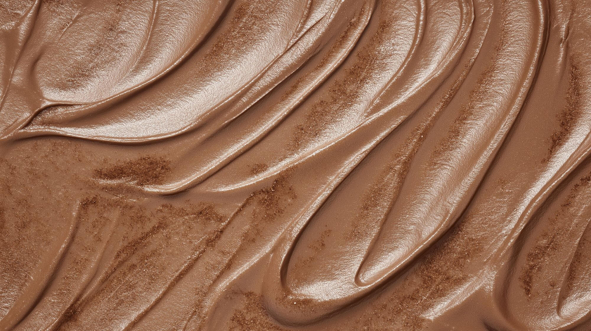
Pantone’s 2025 colour of the year: An accurate self-reflection?
“A moment of luxury” amidst an otherwise frugal time, Mocha Mousse might just be the colour that sets the tone for 2025.
Although Pantone may no longer be the industry standard of design and print that it once was, largely thanks to the monopolisation of its partnership with Adobe, its colour of the year programme is still very much alive.
The carefully-considered colour choice has been designed to capture the global zeitgeist since 1999, sparking an annual discourse amongst designers across the world.
But does this year’s colour hit the mark? And will it actually set the trends for 2025, or just reflect a mood that has already begun?

A tame choice in times of chaos
As ever, 2025’s colour has received mixed reviews from the design industry, including that of our own team here at Crush.
Whilst we can appreciate the soft, delicacy and neutrality of this year’s brown shade, especially after the somewhat politically turbulent year of 2024, the colour does also seem to leave you longing for something ‘more’ from the otherwise safe and uninspiring Mocha Mousse.
Some had predicted this year’s colour to be a striking royal blue, or even a daring shade of cyan. This was the case for Avalana Simpson of Manchester England-based Avalana Design, choosing a punchy pink reminiscent of 2023-2024’s Barbie-craze. But the colour this time is for 2025, after all, and the world is strikingly different today as it was even just 2 years ago.
Others, however, have welcomed the shade as an accurate representation of the world’s mood, particularly our buying habits. Over the past year, shoppers have been reported to be making fewer purchases, focusing on products that are “seasonless, genderless and highly versatile” as a result of rising living costs and an increasing urgency for sustainability.
Mocha Mousse also rather accurately reflects that of our mainstream fashion and interior tastes, sitting amongst colour palettes of both neutral ‘relaxed elegance’ and brighter ‘floral pathways’. Objectively, it’s a rather non-offensive shade, easily imagined within clothing or interior design choices.
“An unpretentious classic”
Speaking on the choice towards Mocha Mousse, Leatrice Eiseman, Executive Director Pantone Color Institute, noted that the hue, “extends our perceptions of the browns from being humble and grounded to embrace aspirational and luxe”.
“For 2025, the Pantone Color Institute selects PANTONE 17-1230 Mocha Mousse, a warming, brown hue imbued with richness. It nurtures us with its suggestion of the delectable qualities of chocolate and coffee, answering our desire for comfort.”
Speaking on the choice towards Mocha Mousse, Leatrice Eiseman, Executive Director Pantone Color Institute, noted that the hue, “extends our perceptions of the browns from being humble and grounded to embrace aspirational and luxe”.
The notion of the brown reflecting the “thoughtful indulgence” that we are craving amongst a time of economic restraint and climate anxiety does seem rather convincing. It also seems to be a subtle evolution to 2024’s Peach Fuzz, which evoked a similar quiet peacefulness, one that was slightly warmer, brighter and perhaps more hopeful than 2025’s Mocha Mousse.
Reflecting on 2024, this year has seen a major series of events take place. Of course, the UK and US elections spring to mind, polarising events in of themselves, as well as that of the growing disparity of political leanances across Europe. Socially, too, attitudes have been changing towards an anti-establishment and anti-corporation ethos across the US and Europe, moving people to campaign in shopping local produce and resisting larger corporations.
2024 has also been a chaotic year of yet more extreme weather, tapping on our shoulder to remind us of the looming climate crisis.
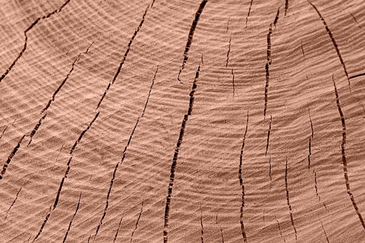
We see brown across mother nature, in its trees, earth, dried grass and sand; a representation of dependability and security. Combining this with our relation to the familiar browns of rich coffee and chocolate, Mocha Mousse blends our growing interest in home comforts with humanity’s desire to reconnect to the natural world.
Our take
Thinking about these themes, we’ve decided to have a crack at selecting our own Colour of the Year here at CRUSH.
Whether it be drawing inspiration from major global events, societal moods or from our own personal achievements this year, each of our team has their own take, because real strength lies in differences!
