Case Study
Wilkins Vardy
Brand + Rollout
With over 50 years in real estate, Wilkins Vardy were regarded as the most successful estate agency in our local area. Looking to remain relevant in a highly competitive market, Wilkins Vardy briefed us on a rebrand with the goal of retaining their heritage, while also appealing to younger buyers who favour searching for property online. In an area with a broad audience demographic and range of housing stock, we needed to strike a balance with a brand that felt premium and trustworthy, whilst also feeling accessible and affordable.


How do you retain 50 years of earned brand equity AND make a brand current and attractive to a new generation of buyers?
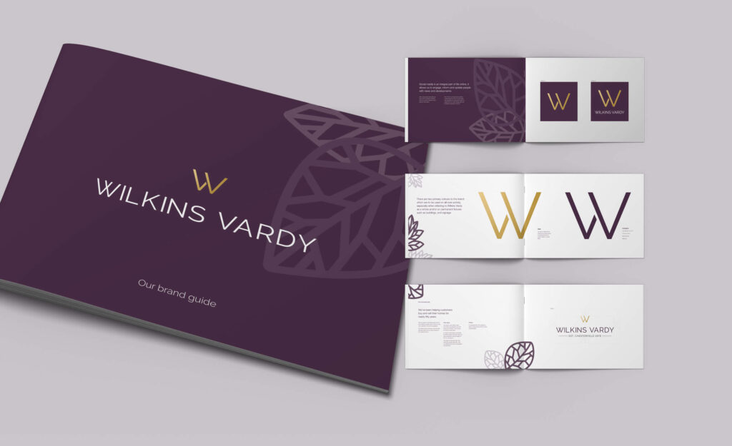
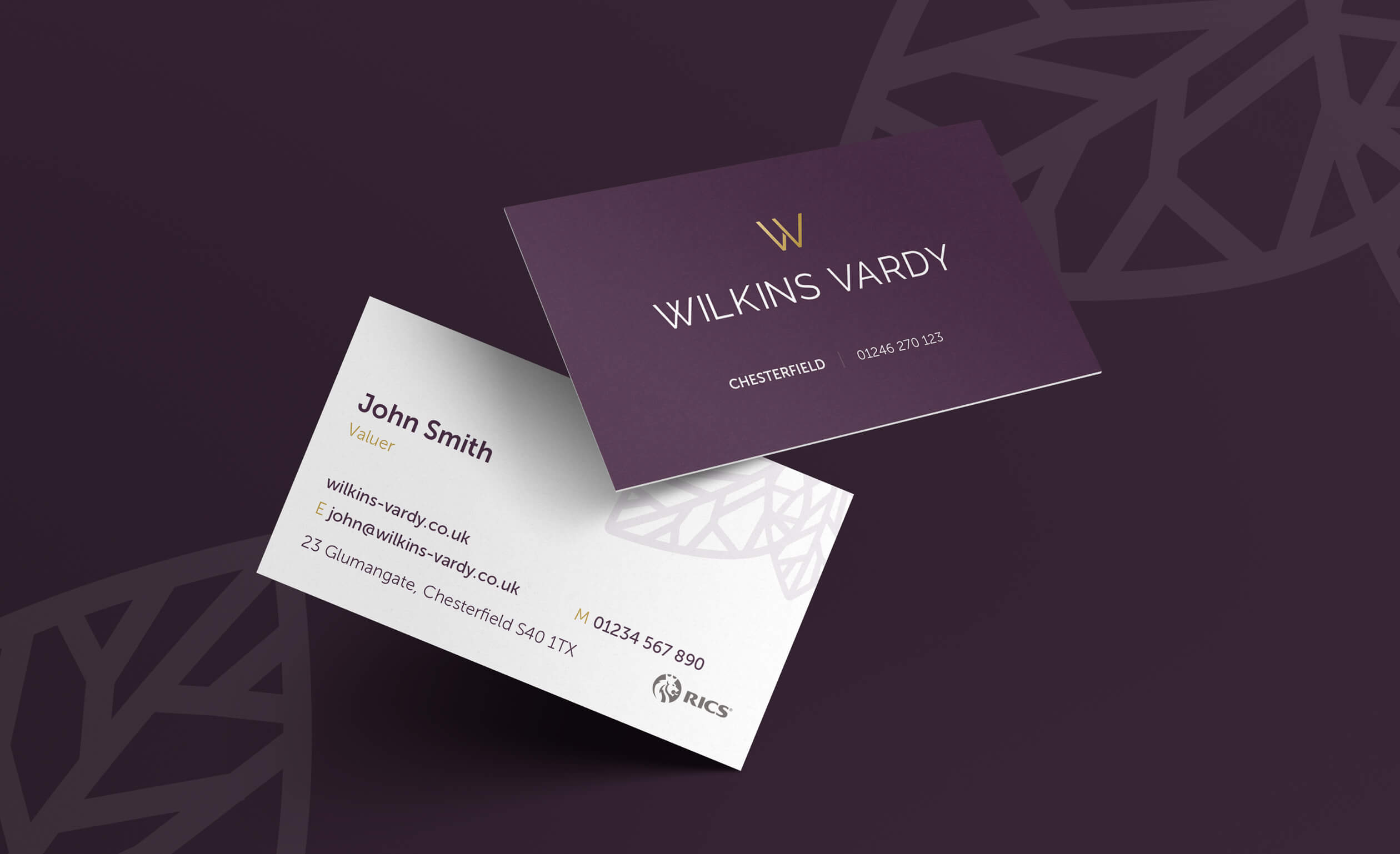
The new Chesterfield-wide brand needed to be seen as good quality and attainable, yet aspirational and stylish. Crush created an identity featuring heritage colours, but modern typographic elements designed to convey a contemporary brand with traditional, honest values and gold standard local knowledge.
Key Deliverables
- Logo design
- Brand identity
- Brochures + sales collateral
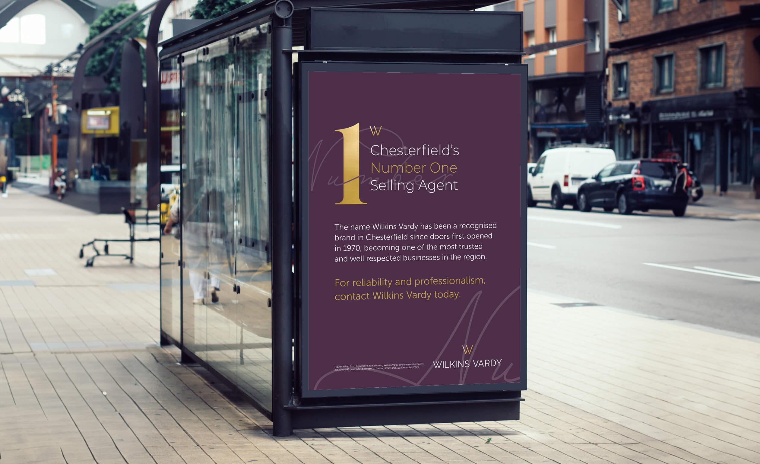
- Signage
- Marketing materials
From our client
“The thought of modernising our 50 year old brand whilst maintaining its identity was something we knew had to happen, but was totally daunting. Crush listened and walked us through the various options with knowledge and enthusiasm. We knew we were in good hands, and wouldn’t hesitate to recommend them. ”
Daniel Elliot, Managing Director, Wilkins Vardy